ก่อนที่ผู้บริโภคจะกลืนผลิตภัณฑ์เสริมอาหารของคุณ พวกเขาจะ “ลิ้มรส” ด้วยสายตา การวิจัยในด้านการตลาดประสาทวิทยาเผยให้เห็นว่าลักษณะที่ปรากฏทางสายตาคิดเป็นถึง 85% ของการตัดสินใจซื้อ สีของแคปซูลของคุณไม่ใช่เพียงแค่การเลือกเพื่อความสวยงามเท่านั้น แต่ยังเป็นตัวกระตุ้นทางจิตวิทยาที่ทรงพลังซึ่งกำหนดความคาดหวังในประสิทธิภาพก่อนที่กระบวนการย่อยอาหารจะเริ่มต้นขึ้น.
ปรากฏการณ์นี้ ซึ่งมักเชื่อมโยงกับ “ผลยาหลอก” กำหนดวิธีที่เรารับรู้ยาและอาหารเสริม แคปซูลสีแดงสดใสสื่อถึงพลังงาน การเผาผลาญ และความเข้มข้น ทำให้เหมาะสำหรับโภชนาการกีฬา ในทางกลับกัน สีฟ้าอ่อนและสีเขียวสื่อถึงความสงบ ธรรมชาติ และความปลอดภัย ซึ่งสอดคล้องอย่างลงตัวกับผลิตภัณฑ์ช่วยการนอนหลับหรือสมุนไพรบรรเทาความเครียด.
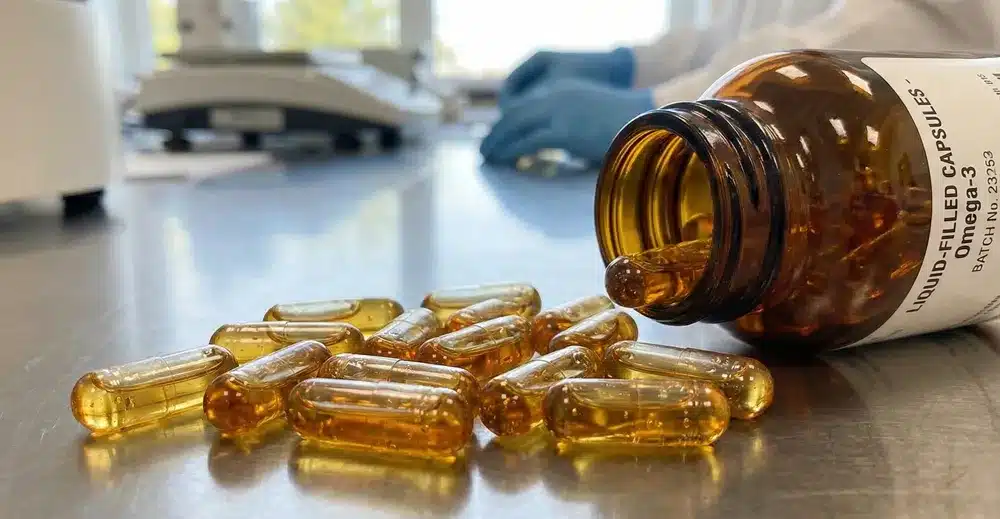
อย่างไรก็ตาม เจ้าของแบรนด์ยุคใหม่กำลังเผชิญกับภาวะกลืนไม่เข้าคายไม่ออกทางกลยุทธ์ การเติบโตของกระแส “ฉลากสะอาด” ได้ทำให้แคปซูลใสกลายเป็นสัญลักษณ์ของความโปร่งใสและความบริสุทธิ์ (“เห็นอะไรก็ได้สิ่งนั้น”) แต่เปลือกแคปซูลใสกลับไม่ช่วยอำพรางสีของวัตถุดิบที่ไม่สม่ำเสมอเลย และยังให้การปกป้องแสงน้อยมากอีกด้วย.
ในคู่มือนี้ เราจะสำรวจการต่อสู้เชิงกลยุทธ์ระหว่างแคปซูลสีกับแคปซูลใส ตั้งแต่การทำความเข้าใจความแตกต่างทางจิตวิทยาของผู้บริโภคไปจนถึงการใช้ประโยชน์ของเปลือกแคปซูลทึบแสงสำหรับส่วนผสมที่ไวต่อแสง เราจะช่วยคุณเลือกอัตลักษณ์ทางสายตาที่ช่วยเพิ่มทั้งความน่าสนใจบนชั้นวางและความเสถียรของผลิตภัณฑ์ของคุณ.
ถอดรหัสจิตใต้สำนึก – สีต่างๆ สื่อถึงอะไร?
ในอุตสาหกรรมอาหารเสริม สีถือเป็นส่วนประกอบที่มีหน้าที่เฉพาะ มันทำหน้าที่เป็นเส้นทางการสื่อสารโดยตรงไปยังจิตใต้สำนึกของผู้บริโภค งานวิจัยด้านประสาทการตลาดชี้ให้เห็นว่า สีของเม็ดยาสามารถส่งผลต่อการรับรู้ของผู้บริโภคเกี่ยวกับประสิทธิภาพของมัน—ปรากฏการณ์นี้มีความเชื่อมโยงอย่างใกล้ชิดกับผลของยาหลอก.
ตัวอย่างเช่น การบรรจุยานอนหลับในแคปซูลสีแดงสดจะก่อให้เกิดความไม่สอดคล้องทางความคิด สีจะสื่อถึงความตื่นตัวในขณะที่ฉลากระบุว่าเป็นยานอนหลับ ซึ่งอาจลดความพึงพอใจที่ผู้ใช้รับรู้ได้.
นี่คือวิธีการจัดสีแคปซูลให้สอดคล้องกับประโยชน์ที่ผลิตภัณฑ์ของคุณต้องการ:
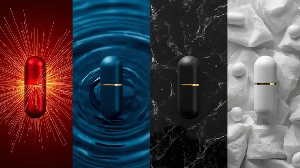
- สีแดงและสีส้ม: สีแห่งพลังงานและความเร็ว
- ตัวกระตุ้นทางจิตวิทยา: การกระตุ้น ความร้อน ความเร่งด่วน และการไหลเวียนของเลือด สีแดงทำหน้าที่เป็นตัวกระตุ้นทางสายตาต่อระบบประสาทส่วนกลาง.
- เหมาะที่สุดสำหรับ: โภชนาการกีฬา (ก่อนออกกำลังกาย), ยาลดน้ำหนัก (เทอร์โมเจนิกส์), และบรรเทาอาการปวดเฉียบพลัน (ระบุ “ออกฤทธิ์เร็ว”).
- สีน้ำเงินและสีเขียว: สีแห่งความสงบและธรรมชาติ
- ตัวกระตุ้นทางจิตวิทยา:
- สีน้ำเงิน: เกี่ยวข้องกับความสงบ ความผ่อนคลาย และความไว้วางใจทางคลินิก (สีที่สื่อถึง “ทางการแพทย์”) ช่วยลดอัตราการเต้นของหัวใจเมื่อมองด้วยสายตา.
- สีเขียว: เป็นสัญลักษณ์ของธรรมชาติ, ต้นกำเนิดจากธรรมชาติ, และความปลอดภัย.
- เหมาะที่สุดสำหรับ:
- สีน้ำเงิน: ผลิตภัณฑ์ช่วยการนอนหลับ (เมลาโทนิน), สูตรลดความเครียด (อชวากันดา), และผลิตภัณฑ์ให้ความชุ่มชื้น.
- สีเขียว: สารสกัดจากสมุนไพร, ผสมซูเปอร์กรีน, และวิตามินรวมออร์แกนิก.
- ตัวกระตุ้นทางจิตวิทยา:
- ดำ & ทอง: สีแห่งพลังและความหรูหรา
- ตัวกระตุ้นทางจิตวิทยา: ความเป็นเอกลักษณ์ ความโดดเด่น ความเป็นชาย และคุณภาพระดับพรีเมียม แคปซูลสีดำโดดเด่นบนชั้นวางสินค้าด้วยความ “แข็งแกร่ง” และ “จริงจัง”
- เหมาะที่สุดสำหรับ: ผลิตภัณฑ์เสริมสุขภาพผู้ชาย (ผลิตภัณฑ์เพิ่มฮอร์โมนเทสโทสเตอโรน), สูตรพรีเมียมต่อต้านริ้วรอย (เช่น เอ็นเอ็มเอ็น หรือ เรสเวอรัตrol) และส่วนผสมที่เป็นกรรมสิทธิ์ที่มีราคาสูง.
- สีขาว: สีแห่งความบริสุทธิ์ทางคลินิก
- ตัวกระตุ้นทางจิตวิทยา: ความปราศจากเชื้อ ความสะอาด และความเป็นกลาง สีขาวสื่อถึงความปลอดภัย มาตรฐาน และปราศจากสิ่งที่ไม่จำเป็น.
- เหมาะที่สุดสำหรับ: แร่ธาตุที่จำเป็น (แคลเซียม, แมกนีเซียม), วิตามินพื้นฐาน, และสูตรที่ออกแบบมาสำหรับเด็กหรือกลุ่มประชากรที่ไวต่อสาร (การย่อยอาหารที่อ่อนโยน).
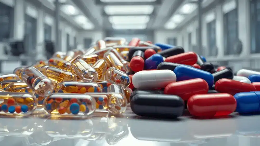
| แคปซูลสี | ตัวกระตุ้นทางจิตวิทยา (การรับรู้ของผู้บริโภค) | การใช้งานผลิตภัณฑ์ที่ดีที่สุด |
| แดง / ส้ม | พลังงาน, ความเร่งด่วน, ความร้อน, ความเร็ว, พลัง | พรีเวิร์คเอาท์, ลดน้ำหนัก (เทอร์โมเจนิกส์), บรรเทาอาการปวด |
| สีน้ำเงิน / สีเขียว | ความสงบ, ความไว้วางใจทางคลินิก, ธรรมชาติ, ความปลอดภัย | ยานอนหลับ, บรรเทาความวิตกกังวล, สารสกัดจากสมุนไพร, โปรไบโอติกส์ |
| สีดำ / สีทอง | หรูหรา, ทรงพลัง, ความเป็นชาย, ความพิเศษเฉพาะตัว | สุขภาพผู้ชาย (เทสโทสเตอโรน), พรีเมียมต่อต้านริ้วรอย, โนโอโทรปิกส์ |
| ขาว | ความบริสุทธิ์, ความปราศจากเชื้อ, อ่อนโยน, มาตรฐานทางการแพทย์ | วิตามินพื้นฐาน, แร่ธาตุ (แคลเซียม), สูตรสำหรับเด็ก |
| โปร่งใส (โปร่งใส) | ความซื่อสัตย์, “ไม่ซ่อนเร้น,” ป้ายสะอาด, ธรรมชาติ | ผลิตภัณฑ์ฉลากสะอาด น้ำมันหรือเม็ดกลมที่ดูน่ารับประทาน |
เหตุผลที่ควรเลือกใช้แคปซูลใส
ในทศวรรษที่ผ่านมา ได้เกิดการเปลี่ยนแปลงอย่างมีนัยสำคัญในแผนกอาหารเสริม: ผู้บริโภคเริ่มมีความสงสัยมากขึ้นเกี่ยวกับสิ่งที่ “ซ่อนอยู่” ภายในเปลือกที่ไม่โปร่งใส. ภายใต้การขับเคลื่อนของกระแส “ฉลากสะอาด” แคปซูลใสได้กลายเป็นสัญลักษณ์ที่สมบูรณ์แบบของความซื่อสัตย์ ความบริสุทธิ์ และการแปรรูปน้อยที่สุด.
1. ความโปร่งใสทางสายตา = ความไว้วางใจในแบรนด์ แคปซูลที่ใสสะอาดสื่อถึงข้อความที่ทรงพลัง: “เราไม่มีอะไรต้องปิดบัง” เมื่อลูกค้าสามารถมองเห็นผง, เม็ดเล็ก, หรือ น้ำมันภายในได้ทางกายภาพ ความโปร่งใสทางสายตาจะแปลเป็นความซื่อสัตย์ของแบรนด์ในทางจิตวิทยา นี่คือตัวเลือกที่ได้รับความนิยมสำหรับแบรนด์พรีเมียมที่ทำการตลาดด้วยข้อความ “ไม่มีสารเติมแต่ง,” “ความบริสุทธิ์เต็มเปี่ยม,” หรือ “วัตถุดิบธรรมชาติ”
2. ปราศจากสารเติมแต่งและสีสังเคราะห์ การเลือกใช้เปลือกใสช่วยให้คุณตัดสีสังเคราะห์ออกจากรายการส่วนผสมทั้งหมดได้ ไม่ว่าจะเป็นสารสังเคราะห์หรือธรรมชาติ นี่เป็นจุดขายสำคัญสำหรับกลุ่มผู้บริโภคที่ใส่ใจสุขภาพ (เช่น ตลาดสำหรับสตรีมีครรภ์หรือผู้ที่มีอาการแพ้) นอกจากนี้ยังช่วยให้หลีกเลี่ยงข้อกำหนดทางกฎหมายและข้อกังวลด้านสุขภาพที่เกี่ยวข้องกับสารเติมแต่ง เช่น ไทเทเนียมไดออกไซด์ (TiO2) หรือสีสังเคราะห์ (เช่น สีแดง 40) โดยอัตโนมัติ.
3. ความเสี่ยง: เมื่อความโปร่งใสกลับกลายเป็นผลเสีย อย่างไรก็ตาม ความโปร่งใสเป็นดาบสองคม หากปราศจากการ “แต่งเติม” ด้วยสี วัตถุดิบของคุณจะต้องไร้ที่ติในเชิงภาพ:
- ความไม่น่าดึงดูดทางสุนทรียภาพ: สารสกัดจากสมุนไพรหลายชนิดมีลักษณะขุ่น สีน้ำตาล หรือมีจุดประ ซึ่งอาจทำให้ผู้บริโภคที่ไม่มีความรู้เข้าใจผิดว่าผลิตภัณฑ์นั้น “เสีย” หรือ “มีเชื้อรา”
- ความแปรปรวนของชุดการผลิต: ส่วนผสมจากธรรมชาติมีสีที่แตกต่างกันในแต่ละฤดูกาลเก็บเกี่ยว แคปซูลใสจะเผยให้เห็นความไม่สม่ำเสมอเหล่านี้ ซึ่งอาจนำไปสู่ข้อร้องเรียนจากลูกค้าเกี่ยวกับเหตุผลที่ว่า “ขวดนี้ดูแตกต่างจากขวดก่อน”
- การป้องกันแสง 0% แคปซูลใสแทบไม่ให้การปกป้องจากแสง UV เลย หากสูตรของคุณมีส่วนผสมที่ไวต่อแสง (เช่น วิตามินบี, โคเอนไซม์คิวเท็น หรือโพรไบโอติกส์) การใช้เปลือกแคปซูลใสอาจทำให้เกิดการออกซิเดชันอย่างรวดเร็วและสูญเสียประสิทธิภาพ เว้นแต่จะบรรจุในขวดทึบแสงที่มีคุณสมบัติป้องกันสูง (เช่น ขวดแก้วสีอำพันเข้ม).
มากกว่าความสวยงาม – พลังปกป้องของเปลือกทึบแสง
ในขณะที่แคปซูลใสครองเรื่อง “ฉลากสะอาด”, แคปซูลทึบแสง ยังคงมีความจำเป็นอย่างยิ่งในวิทยาศาสตร์การคิดค้นสูตรขั้นสูง ที่นี่ สีไม่ได้ทำหน้าที่เป็นเพียงเครื่องมือสร้างแบรนด์เท่านั้น แต่ยังเป็นเกราะป้องกันที่สำคัญในการรักษาความสมบูรณ์ของผลิตภัณฑ์ของคุณ.
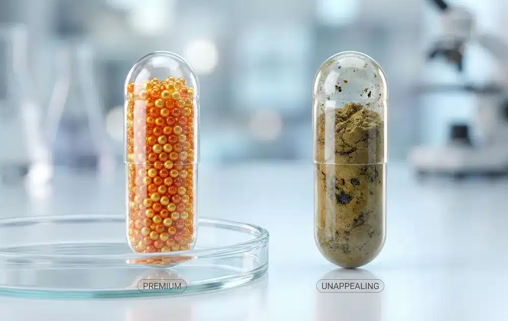
1. “คอนซีลเลอร์” สำหรับวัตถุดิบดิบ (ความสม่ำเสมอทางสายตา) ส่วนผสมจากธรรมชาติเป็นที่รู้กันดีว่ามีความไม่สม่ำเสมอในลักษณะที่ปรากฏ.
- ความแปรปรวนของชุดการผลิต: สีของสารสกัดจากสมุนไพร เช่น ขมิ้นชัน หรือ เอ็กไคนาเซีย อาจเปลี่ยนแปลงอย่างมากระหว่างการเก็บเกี่ยวแต่ละครั้ง เนื่องจากสภาพดินหรือสภาพอากาศ ในบรรจุภัณฑ์ใส ความแตกต่างเหล่านี้จะเห็นได้ชัดเจน ทำให้ผู้บริโภคสงสัยว่า “ทำไมขวดนี้ถึงดูแตกต่างจากขวดที่แล้ว?”
- การปกปิดข้อบกพร่อง ส่วนผสมที่ซับซ้อนมักส่งผลให้เกิดผงที่มีลักษณะเป็นจุดๆ เป็นก้อน หรือดูขุ่นมัว แคปซูลทึบแสงทำหน้าที่เป็น “คอนซีลเลอร์” ช่วยปกปิดข้อบกพร่องด้านความสวยงามเหล่านี้ เพื่อให้มั่นใจในความสม่ำเสมอของรูปลักษณ์ ซึ่งรับประกันว่าแคปซูลทุกเม็ดจะดูเหมือนกัน มีความมืออาชีพ และดูพรีเมียม โดยไม่คำนึงถึงความแตกต่างตามธรรมชาติของวัตถุดิบ ซึ่งช่วยลดข้อร้องเรียนจากลูกค้าได้อย่างมีนัยสำคัญ.
2. “แว่นกันแดด” สำหรับความคงตัวทางแสง (การป้องกันรังสี UV) แสงคือฆาตกรเงียบของความมีประสิทธิภาพ. การเสื่อมสภาพทางแสงสามารถทำให้ส่วนผสมที่มีฤทธิ์ของคุณไม่มีประสิทธิภาพได้นานก่อนวันหมดอายุ.
- ส่วนผสมที่ไวต่อแสง: สารอาหาร เช่น ไรโบฟลาวิน (วิตามิน B2), วิตามินเอ, โคเอนไซม์ คิวเท็น (โคคิวเท็น), กรดโฟลิก และสายพันธุ์โพรไบโอติกหลายชนิดมีความไวต่อแสงสูง.
- กลไกการออกฤทธิ์: แคปซูลทึบแสงทำหน้าที่เป็นเกราะป้องกัน (เหมือนแว่นกันแดด) สำหรับส่วนผสมของคุณ โดยสามารถป้องกันรังสี UV ที่เป็นอันตรายและแสงที่มองเห็นได้ ช่วยชะลอการเกิดออกซิเดชันอย่างมีนัยสำคัญ สำหรับสูตรที่ไม่เสถียรเหล่านี้ การใช้เปลือกแคปซูลทึบแสงไม่ใช่ทางเลือก แต่เป็นข้อกำหนดเพื่อความเสถียรของผลิตภัณฑ์.
3. การซ่อนสัญญาณของการเกิดออกซิเดชัน ส่วนผสมบางอย่าง เช่น วิตามินซี อาจเปลี่ยนเป็นสีเหลืองเล็กน้อยเมื่อเกิดการออกซิเดชันเล็กน้อย แม้ว่าผลิตภัณฑ์อาจยังคงปลอดภัย แต่การเปลี่ยนแปลงทางสายตาอาจทำให้ผู้บริโภคเข้าใจว่า “เสีย” เปลือกทึบแสงช่วยซ่อนสัญญาณเริ่มต้นของการเสื่อมสภาพเหล่านี้ ทำให้สามารถยืดอายุการเก็บรักษาทางสายตาของผลิตภัณฑ์ในเชิงพาณิชย์ได้อย่างมีประสิทธิภาพ.
การดำเนินชีวิตในโลกที่ปราศจาก TiO2
เป็นเวลาหลายทศวรรษ, ไททาเนียมไดออกไซด์ (TiO2) เป็น “มาตรฐานทองคำ” ของอุตสาหกรรมในการสร้างแคปซูลสีขาวทึบและสว่างสดใส อย่างไรก็ตาม เกมได้เปลี่ยนไปอย่างถาวรด้วยการบังคับใช้ของสหภาพยุโรปในเรื่อง E171 ห้ามใช้ ในปี 2022 ได้จัดให้ TiO2 เป็นสารที่ไม่ปลอดภัยสำหรับการใช้เป็นวัตถุเจือปนอาหาร เนื่องจากความกังวลเกี่ยวกับความเป็นพิษต่อพันธุกรรม.
แม้ว่าแบรนด์ของคุณจะดำเนินงานอยู่นอกสหภาพยุโรป ผลกระทบที่แพร่กระจายไปทั่วโลกก็ไม่อาจปฏิเสธได้ ด้วยแรงขับเคลื่อนจากการรวมตัวของห่วงโซ่อุปทานและความต้องการของผู้บริโภคที่มองหาผลิตภัณฑ์ “Clean Label” การเปลี่ยนไปสู่ ไม่มีไททาเนียมไดออกไซด์ การคิดค้นสูตรไม่ใช่ทางเลือกเฉพาะกลุ่มอีกต่อไป—แต่เป็นมาตรฐานใหม่ของอุตสาหกรรม.
1. จุดจบของ E171 (ไทเทเนียมไดออกไซด์) TiO2 เคยเป็นที่ต้องการสูงเนื่องจากมีดัชนีการหักเหของแสงสูง ทำให้ได้พื้นผิวสีขาวสดใสและคมชัด ซึ่งสามารถปกปิดวัตถุดิบดิบได้อย่างมีประสิทธิภาพ การถูกนำออกไปได้ทิ้งช่องว่างขนาดใหญ่ไว้ในเครื่องมือการผลิต: เราจะทำแคปซูลให้ทึบแสงได้อย่างไรโดยไม่มีมัน?
2. ทางเลือกชั้นนำ: แคลเซียมคาร์บอเนต แคลเซียมคาร์บอเนต (CaCO3) ได้กลายเป็นตัวเลือกหลักในการสร้างเปลือกสีขาวและทึบแสง.
- ความแตกต่างทางสุนทรียศาสตร์: ในขณะที่ TiO2 ให้สีขาวสว่างแบบสังเคราะห์ “Bright White” แคลเซียมคาร์บอเนตให้สีขาวด้านที่เป็นธรรมชาติและดูอบอุ่นแบบ “Matte White” หรือ “Creamy” มากกว่า.
- ประสิทธิภาพทางเทคนิค: ในฐานะที่เป็นแร่ธาตุที่เกิดขึ้นตามธรรมชาติ CaCO3 สอดคล้องอย่างสมบูรณ์กับแนวโน้มฉลากสะอาด แม้ว่าจะต้องใช้ปริมาณมากกว่าเพื่อให้ได้ระดับความทึบแสงเท่ากับ TiO2 แต่เทคโนโลยีการบดละเอียดขั้นสูงได้ทำให้แคปซูลแคลเซียมคาร์บอเนตคุณภาพสูงมีประสิทธิภาพแทบไม่แตกต่าง และให้การปกป้องจากรังสียูวีได้อย่างมีประสิทธิภาพ.
3. การเพิ่มขึ้นของสีธรรมชาติ นอกเหนือจากสีขาว อุตสาหกรรมกำลังหันหลังให้กับสีสังเคราะห์ (เช่น สีแดง 40 หรือ สีเหลือง 6) ไปสู่ทางเลือกที่เสถียร ผลิตจากพืช และแร่ธาตุ:
- เหล็กออกไซด์: มาตรฐานสำหรับสีแดง สีเหลือง และสีดำที่คงที่.
- คลอโรฟิลลิน: สกัดจากพืชเพื่อสีเขียวที่เข้มข้น.
- สาหร่ายสไปรูลิน่า & แครอทม่วง: ใช้สำหรับสีน้ำเงินและสีม่วงที่สดใส (แม้ว่าสีเหล่านี้จะต้องทดสอบความเสถียรอย่างระมัดระวัง).
⚠️ เคล็ดลับสำหรับเจ้าของแบรนด์: สีธรรมชาติมีพฤติกรรมแตกต่างจากสีสังเคราะห์ สีธรรมชาติอาจมีผิวสัมผัสแบบ “แมตต์” และอาจไวต่อการเปลี่ยนแปลงของค่า pH ได้เล็กน้อย อย่างไรก็ตาม ลักษณะที่ “ไม่สมบูรณ์แบบ” นี้กำลังถูกมองโดยผู้บริโภคมากขึ้นว่าเป็นเครื่องหมายของความเป็นของแท้และคุณภาพระดับพรีเมียม.
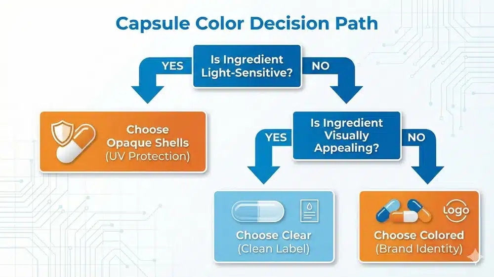
4 ขั้นตอนตรวจสอบแบรนด์ของคุณ
การเลือกสีแคปซูลไม่ควรเป็นเพียงการเดาสุ่ม ก่อนที่คุณจะสรุปข้อมูลจำเพาะของผลิตภัณฑ์ (Spec Sheet) ให้ตรวจสอบสูตรของคุณผ่านรายการตรวจสอบเชิงกลยุทธ์นี้เพื่อป้องกันข้อผิดพลาดในการปรับสูตรใหม่ที่มีค่าใช้จ่ายสูงในอนาคต.
✅ ขั้นตอนที่ 1: การตรวจสอบความเสถียร (ความไวต่อแสง) สูตรของคุณมีส่วนผสมที่ไวต่อแสง (เช่น ไรโบฟลาวิน, โคเอนไซม์คิวเท็น, โปรไบโอติกส์, เรตินอล) หรือไม่?
- ใช่: คุณ ต้องเลือกแบบทึบแสง. เปลือกทึบแสง (ควรมีสารดูดซับแสงเช่นแคลเซียมคาร์บอเนต) ทำหน้าที่เป็นเกราะป้องกันการทำลายจากแสง.
- ไม่: คุณมีความยืดหยุ่นในการใช้ ชัดเจน หรือเปลือกกึ่งโปร่งใส.
✅ ขั้นตอนที่ 2: การตรวจสอบด้วยสายตา (ความสวยงามของส่วนผสม) ผงผสมดิบของคุณมีลักษณะอย่างไร? มีความสม่ำเสมอในแต่ละชุดการผลิตหรือไม่?
- ไม่น่าดึงดูด / ไม่สม่ำเสมอ (เช่น สารสกัดสมุนไพรขุ่น, ส่วนผสมที่มีจุดด่าง): เลือกแบบทึบสี ใช้สีเพื่อปกปิดข้อบกพร่องและรับประกัน “ลุคพรีเมียม” ที่สม่ำเสมอเมื่อวางบนชั้นวาง.
- ดึงดูด / ไม่เหมือนใคร (เช่น, บี12 สีชมพู, น้ำมันเหลว, ลูกปัดเล็ก): เลือกความใส ให้ส่วนผสมโดดเด่น ความโปร่งใสที่เห็นนี้คือความบริสุทธิ์.
✅ ขั้นตอนที่ 3: การตรวจสอบด้านกฎระเบียบ (การปฏิบัติตามข้อกำหนด) คุณวางแผนที่จะขายในสหภาพยุโรป (EU) หรือแบรนด์ของคุณมีการวางตำแหน่งเป็น “100% Natural” หรือไม่?
- ใช่: คุณต้องหลีกเลี่ยงไทเทเนียมไดออกไซด์ (TiO2) ให้เลือกแคปซูลใสหรือแคปซูลทึบแสงที่ปราศจาก TiO2 (โดยใช้แคลเซียมคาร์บอเนตหรือสีธรรมชาติ).
- ไม่ (เฉพาะตลาดมวลชนในสหรัฐอเมริกา/เอเชีย): คุณยังสามารถใช้ TiO2 สำหรับการเคลือบผิวแบบ “ขาวสว่าง” ได้ตามต้องการ แต่ควรทราบว่าแนวโน้มทั่วโลกกำลังเปลี่ยนไปจากสิ่งนี้.
✅ ขั้นตอนที่ 4: การตรวจสอบแบรนด์ (Brand Archetype) บุคลิกภาพของผลิตภัณฑ์ของคุณคืออะไร?
- คลินิก / วิทยาศาสตร์: ไปกับ ขาว หรือ สีน้ำเงิน (สัญญาณ: ความไว้วางใจ, ความปลอดภัยทางการแพทย์).
- พลังงาน / กีฬาผาดโผน ไปกับ สีแดง หรือ ดำ (สัญญาณ: พลังงาน, ความเร็ว, ความเข้มข้น).
- ออร์แกนิค / ฉลากสะอาด: ไปกับ ชัดเจน หรือ สีเขียว (สัญญาณ: ความซื่อสัตย์, ธรรมชาติ, ไม่มีสารเติมแต่ง).
สรุป: สีเป็นสินทรัพย์เชิงกลยุทธ์ ไม่ใช่เพียงแค่การตกแต่ง
สีแคปซูลของเราคือจุดตัดที่จิตวิทยาแบรนด์ ความเสถียรของส่วนผสม และการปฏิบัติตามข้อกำหนดทางกฎหมายมาบรรจบกัน.
- แคปซูลใส สร้างความไว้วางใจและสอดคล้องกับการปฏิวัติ “ฉลากสะอาด”.
- แคปซูลสี ให้การปกป้องที่สำคัญสำหรับส่วนผสมที่บอบบางและกระตุ้นสัญญาณที่ทรงพลังในจิตใต้สำนึกเกี่ยวกับประสิทธิภาพ.
- ตัวเลือกที่ปราศจาก TiO2 ทำให้แน่ใจว่าสินค้าของคุณยังคงทันสมัยในอนาคตในตลาดโลก.
อย่าให้การเลือกแคปซูลของคุณเป็นเรื่องรอง ความเหมาะสมของเปลือกแคปซูลสามารถเพิ่มความน่าสนใจบนชั้นวางสินค้า ปกป้องประสิทธิภาพของผลิตภัณฑ์ และลดการคืนสินค้าจากลูกค้า.
🚀 พร้อมที่จะกำหนดเอกลักษณ์ทางภาพของแบรนด์คุณหรือยัง? ไม่ว่าคุณจะต้องการเปลือกใสที่ชัดเจนเพื่อโชว์ลูกปัดพรีเมียมของคุณ หรือเปลือกทึบแสงที่จับคู่สี Pantone เฉพาะตัวและปราศจาก TiO2 100% เราก็มีเทคโนโลยีที่จะทำให้เป็นจริงได้.
- ขอการจับคู่สี: ส่งพาเลตต์สีของแบรนด์คุณมาให้เรา แล้วเราจะสร้างตัวอย่างเฉพาะสำหรับคุณ.
- รับคำปรึกษาด้านความมั่นคง ไม่แน่ใจว่ารูปแบบของคุณต้องการการป้องกัน UV หรือไม่? ผู้เชี่ยวชาญในห้องปฏิบัติการของเราสามารถให้คำแนะนำคุณได้.
👉 ติดต่อผู้เชี่ยวชาญด้านสีของเรา.
แคปซูลทึบแสงให้การปกป้องที่เหนือกว่าต่อการออกซิเดชันจากแสง คุณสมบัติในการปกป้องนี้เป็นหนึ่งในเหตุผลหลักที่ทำให้แคปซูลเป็นที่นิยมมากกว่าเม็ดยาหรือผง คุณสามารถเรียนรู้เพิ่มเติมเกี่ยวกับการเปรียบเทียบแคปซูลกับรูปแบบยาอื่น ๆ ได้ในส่วน ‘ข้อดีและข้อเสีย’ ของ คู่มือฉบับสมบูรณ์เกี่ยวกับอาหารเสริมแคปซูล.
คำถามที่พบบ่อย
แหล่งอ้างอิง
การทบทวนอย่างเป็นระบบของ ผลกระทบของสีของยา.
ไททาเนียมไดออกไซด์: E171 ไม่ถือว่าปลอดภัยอีกต่อไปเมื่อใช้เป็นวัตถุเจือปนอาหาร.